
Engineering · Guide · 5 MIN READ
Speed by Keyboard: Why Pretty Interfaces Slow Down Data Entry
An old terminal system gives way to a modern, click-happy web interface — and throughput collapses. Why keyboard parity is decisive for heavy data-entry users.
strukturunion Team · October 19, 2021
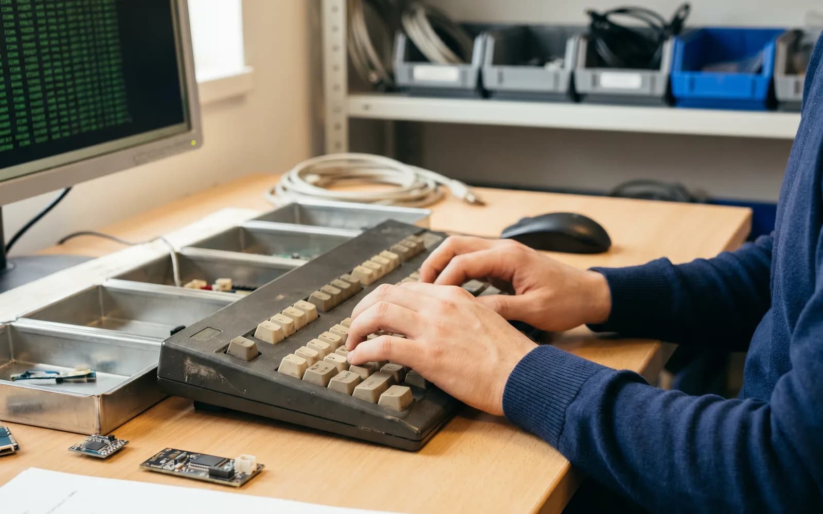
Management replaces an old, text-based terminal system with a modern, attractive, click-happy web interface. The result surprises many: data-entry throughput collapses immediately, and the clerks complain of fatigue in hand and arm. The new software looks better than anything before it — and yet the work has become slower and more exhausting.
The pattern
Modern interface design focuses heavily on visual accessibility and discoverability. Almost always, that means the mouse is at the center. For occasional users, that is exactly right. For a professional heavy data-entry user who enters thousands of similar data points every day, every movement of the hand from keyboard to mouse and back is a massive mechanical drag.
A terminal operator works from muscle memory. They execute complex key sequences in fractions of a second, often without looking at the screen. Forcing a mouse-driven interface on such a team delivers a fundamental ergonomic step backward — even if the new system looks more modern at first glance. Visual beauty is simply not the same as operational efficiency. That very confusion is what sits behind the collapsed throughput.
From our practice
That was a painful but important lesson for us. We saw for ourselves how an aesthetically convincing interface slowed down a well-drilled team. Since then, a firm rule applies with us: aesthetics are no substitute for operating speed. When we lay modern web interfaces over existing systems, we consistently insist on full keyboard parity.
In concrete terms, we look for:
- Every action is reachable by keyboard. Every button, every selection field, every switch between tabs can be triggered without a mouse.
- Shortcuts that follow the old rhythm. Where possible, we carry over the key sequences of the predecessor system so that muscle memory is preserved.
- A sensible tab order. The focus moves through the fields in the order in which the data actually arises — not all over the place.
- Sequences instead of single clicks. Recurring workflows can be run as one connected key sequence, not as a series of individual mouse clicks.
Our measure of a successful modernization is clear: a heavy data-entry user must be able to operate the new system at full speed without their hands ever leaving the home position on the keyboard. The pretty interface is allowed — but it must stay secondary to the mouse, not to the keyboard.
Both are possible
The most common fallacy is that you have to choose between a modern interface and fast data entry. That's not true. A web interface can be visually clean and still fully keyboard-operable. The occasional user finds their way with the mouse; the heavy data-entry user flies through the same screens with the keyboard. You just have to design in the fast operation from the start, instead of retrofitting it later.
Takeaway
When throughput collapses after a modernization, it is rarely the technology and almost always the way it's operated. Building full keyboard parity for heavy data-entry users gives you an interface that looks modern and at the same time keeps the pace of the old terminals. If a new piece of software is slower for you than the old one, we're happy to look together at where the operation is stuck.