
Engineering · Guide · 5 MIN READ
The Mirror Principle: Software That Follows Space, Not the Alphabet
An app that sorts inventory alphabetically fights the spatial thinking of the people who work with it. Why an interface should follow physical reality.
strukturunion Team · January 14, 2025
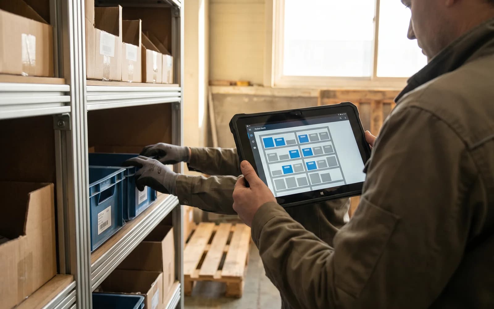
A company rolls out a mobile inventory app to its warehouse staff. The app sorts the items neatly by name, in alphabetical order. The result: the picking team becomes noticeably slower, makes more counting errors, and complains that the arrangement makes no sense. Technically, the sorting is correct. For the people walking the aisles with it, it is an obstacle.
The pattern
Human spatial memory is tightly bound to physical geometry. A warehouse worker thinks of their stock not alphabetically but spatially: by aisle depth, shelf height, weight, by the path they actually walk. When an interface forces an abstract digital sort order that collides with that path, it breaks the spatial flow. The person then has to translate in their head for every item — from the on-screen order into the real walking order. This constant translation costs time and produces errors.
The underlying fallacy is common: a sort order that looks logical in the database is automatically assumed to be logical for the users too. But software that forces people to work against their own perception of space is not tidy — it is in the way. Order on the screen is worthless if it ignores the order in the space.
From our practice
In every design phase we work with what we call the mirror principle: the interface reflects the physical reality of its users, not an abstract data logic. For a picking interface, we matched the flow of data on the screen exactly to the real walking route through the aisles. The items appeared in precisely the order in which they were actually passed in the warehouse. The result was noticeably faster picking — and not a single shelf had to be moved for it.
The key is not to invent the order at a desk, but to observe it on-site. We walk the route ourselves, we watch how an experienced worker moves through the space, and that movement becomes the template for the on-screen order. The software adapts to the person, not the other way around. This reduces the cognitive load, because the user no longer has to translate — they see on the screen what they will reach next anyway.
The principle applies far beyond the warehouse. Wherever people operate software alongside a physical or well-practiced activity, the interface that mirrors their actual sequence wins. A form should follow the order in which information arises in the real process. An overview should show the structure its users already think in. Intuitive does not mean pretty; it means congruent with the reality in which the work is done.
Why this is not a detail
A mirrored interface doesn't just save seconds per operation; it also lowers the error rate and the frustration. Where the screen follows the space, no one has to fight their own perception, and acceptance follows on its own. Where it works against the space, even the most beautiful design helps nothing — users become slower and less accurate, no matter how modern the implementation looks. Ergonomics here is decided not by appearance, but by the match with the way people move.
Takeaway
Software becomes intuitive when it reflects the reality of its users instead of an abstract sort order. Before you fix an order on the screen, it's worth asking how people actually experience the process — in space, in the process, in their practiced movement. If an application slows you down more than it helps, we're happy to look together at whether it follows the real path or works against it.